When you know what to look for, it’s easy to fix some of the things that make a living room feel cheap. The issue is often not spending more, but a few small missteps that quietly undercut the whole room.
When it comes to the common problems that make a room look worse, such as rugs being too small, the wrong lighting, or curtains that are hung too low, there are also simple fixes that can improve a space. Make a few corrections, and your living room will appear much more expensive than it really is.
As an Amazon Associate, we earn from qualifying purchases. This post may contain affiliate links, which means we may receive a small commission at no extra cost to you.
This post contains affiliate links. If you buy through them, we may earn a small commission at no extra cost to you. We only recommend things we’d actually put in our own homes.


A peek at every fix in this article. Tap any to see it on Amazon.
I have put some thought into this article for weeks. Each time I visit a friend’s house, browse Pinterest, or even enter my living room on a bad day, I notice the same few errors repeatedly. The best part is, the mistakes are easy and inexpensive to fix. They just go unnoticed, and no one explains what they are. Until now. (Hello, it’s me, explaining this to you.)
While the furniture may be expensive, there are still home decor errors that give the room an overall cheap appearance. The good news is all of them are fixable. Some issues are even just technique fixes that cost nothing. Other solutions can be found with just a $30 purchase on Amazon. None of the solutions require a complete redesign of your living room, hiring a designer, or even an ounce of artistic ability.
I did the research so you don’t have to. Here we go.
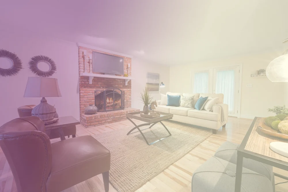
Mistake #1: Your Rug is Way, Way Too Small
This is the biggest mistake. The very biggest. If I could adjust just one thing about the majority of living rooms in the US, it would be the rugs. I see small rugs, like, bath mat size, under coffee tables, with all the legs of the furniture sitting on a bare floor. It really looks like the rug was placed there after it shrunk in the wash — like it was some sort of mistake.
A rug that is too small makes a room look smaller than it is. It breaks up the seating area into separate islands. It makes the nice furniture look stranded like people awkwardly hover near each other without fully committing to being a group. (Which, honestly, that is a huge mood, but it is not the vibe we want for our furniture.)
What to do instead: Get a rug big enough that at least the front legs of every major piece of furniture can sit on it. For most living rooms, that’s an 8×10 minimum. If your space is bigger, go 9×12. The rug should anchor the seating area and pull everything together visually, not float in the middle of the floor like it got lost on the way to a different room.
The DMOYEST 8×10 Washable Area Rug is genuinely a great answer for this, especially if you’re rug-shopping on a budget. It’s neutral, it’s a low-pile abstract pattern that goes with basically any furniture, it’s machine washable (which, hello, if you have any pets or any humans or any general life happening), and it’s non-slip. It’s the kind of rug that just quietly does its job and doesn’t make a fuss about it.
Mistake #2: Using Only the Big Light
There is a single overhead light that is especially bad. It’s brutal, just one light mounted on the ceiling. You walk into the room, flip the switch, and suddenly your living room is being interrogated. (My friend Hannah calls these “the big light” and seems to be right on the money when she refuses to use them after 4 p.m.)
Using one overhead light source flattens everything. It washes out warm tones, makes the room look like a dentist office, and casts weird shadows on faces. And if you happen to have a fan-light combo with a cold white bulb? <insert sad face>. No judgment, some of us have ceiling fans we can’t remove. We’re in this together.
What to do instead: Layered lighting. This is the single biggest “I don’t know why this room feels nicer now” trick in interior design. You want at least three different light sources at three different heights. Floor lamp (tall), table lamp (medium), maybe a small accent lamp or candle (low). Use warm bulbs (look for “soft white” or 2700K, NOT “daylight” or 5000K). Suddenly the room has dimension. Suddenly it feels like a place a real human chose to put themselves in on purpose.
The PESRAE Floor Lamp with Built-In Table is a genuinely useful piece for this. It’s a floor lamp AND a side table AND a charging station, which means in one move you’ve added a layer of lighting AND a surface for your cup of tea AND a place to plug your phone in. (Three problems, one purchase. I love this for us.) The adjustable color temperature is the part that puts it over the top, you can switch between warm cozy light for evenings and brighter light for reading.
Mistake #3: Hanging Curtains Wrong (Yes, There’s a Wrong)
Society has let down a hardworking part of your room: the curtains. Two common mistakes are hanging the rod right above the window frame (making the curtains look short and stubby) and letting the curtains stop above the floor (making them look like they are floating, or worse, like they shrunk). These mistakes will make your ceilings look lower, your windows look smaller, and your room look sad.
I understand. The window frame is RIGHT THERE. It seems the obvious placement for the rod. But truth is, hanging curtains properly will make your room look more expensive than literally any other change you can make.
What to do instead: Hang the curtain rod high and wide. Specifically, hang it about 4-6 inches BELOW the ceiling (or somewhere between the top of the window frame and the ceiling, as high as you can get away with). And hang it wide, the rod should extend at least 4-6 inches past each side of the window frame so when the curtains are open, they don’t cover any of the actual window. Then get curtains long enough that they JUST kiss the floor, or even pool slightly. No floods. No high-water curtains. We are better than that.
No need for products. You’ve curtain’s re hang and gasp at the new look. Thank me later.
Mistake #4: One Lonely Chair (Or Just a Couch and Nothing Else)
I’ve just moved in, and here’s the living room. I appreciate you, but this needs to end. The single couch setup, where that’s the whole seating arrangement. No accent chair. No other perch. Nowhere for a friend to sit if she visits and needs to not sit next to you. (This is a metaphor for connection. Or maybe just about chairs. You choose.)
A room with one piece of furniture feels incomplete. It makes the couch feel stranded. You need one more piece to anchor the conversational zone, even if you live alone. ESPECIALLY when you live alone. You deserve choices.
What to do instead: Add an accent chair. It can be small. It can be weird. It can be the secondhand thing your aunt gave you. The point is just to have a second seating moment that creates a triangle with your couch and a side table or coffee table. Bonus points if the chair has a different texture or color than the couch, that way they balance instead of competing.
The MAXYOYO Accent Chair with Ottoman is a really lovely answer for this if you want something that doesn’t look like every other accent chair on Amazon. It’s got a backrest, it comes with a matching ottoman so you can put your feet up (genuinely the best feeling), and the casual style fits in a room that’s already a little eclectic. It’s a chair that says “yes, this is a real living room, you may stay a while.”
Mistake #5: Your Walls Are Just, Like, Empty
Think of an empty wall in your living room like dead air in a podcast episode. It’s not doing anything, and your eyes keep drifting to it. They wonder, what is going on? Is there supposed to be something here? Am I missing something? The answer is yes, and it is supposed to be there.
I get it, the word “art” can be a little scary. But don’t worry! Art doesn’t have to be an expensive original painting from a fancy gallery. You can display art that is a second hand store find, a baby picture, an Etsy print, an old postcard from a trip, or even a piece of cute fabric stapled to a frame. The goal is to create a visual break on the wall.
What to do instead: If you’re not ready to commit to art (or if you can’t decide), the easiest cheat is a large mirror. A big leaning mirror or wall mirror solves the empty wall problem instantly, AND it bounces light around the room (which, hello, makes everything feel bigger and brighter), AND it’s useful because it’s a mirror.
The DUMOS Arched Full-Length Mirror with Stand is the move here. It leans against the wall (no drilling, no committing), it’s big enough to actually do the job, the arch shape makes it feel like an intentional design choice, and it’s shatter-proof which is reassuring if you’re a person who has, on occasion, knocked things over. (Just me?)
You might also love
15 Home Decor Pieces Every Woman Over 60 Deserves
If you’re done with decorating for everyone else, this is for you. These 15 items will transform your living room into a true adult sanctuary, no compromises needed.
Read the articleMistake #6: Hanging Your Art Way Too High
Let’s talk about art. If you are going to put art on your walls, please. DO NOT hang it at the height of the ceiling. This is common and it is not good! I do not want to have to look up and injure myself to see a piece of art. It is not a billboard, it is an art piece. It is supposed to be viewed at the same height as a person who is in the room with you.
Typically art should hang so that the center of the piece is 57-60 inches off the ground. This is the height of an average human’s eye level, which is standard practice for most museums. I also see a lot of people hang art a foot above their couch because it feels right, but I am sorry to tell you that it is too high. It needs to come down.
What to do instead: If you’re hanging art ABOVE furniture (like over a couch or a console table), the bottom of the frame should be about 6-8 inches above the top of the furniture. That’s it. That’s the rule. Once you start hanging art at the right height, it will look like you hired someone to design your house. People will ask if you got new art. You did not. You just stopped hanging it like it owed you money.
This is a no-product fix. All you need is a measuring tape and a little bit of willingness to put some new holes in your wall. (Spackle is a thing. You’ll be fine.)
Mistake #7: Fake Plants That Look Aggressively Fake
I am pro-fake plant. I want to be clear about that. Real plants are great if you can keep them alive, but not all of us can keep them alive (looking at myself, in the mirror, sadly). Fake plants are a totally legitimate solution. BUT. The fake plant has to be GOOD. It has to be the kind that, from across a room, makes a guest go “oh, what a nice fern.” Not “oh, what a nice plastic representation of a fern that you bought at a craft store in 2008.”
Fake plants are ruining your whole vibe! They have shiny plastic leaves, the dirt isn’t even dirt, and they have cheap pots. From across the room they scream, “I gave up but I wanted something green!”
What to do instead: If you’re going fake, invest in ONE good fake plant rather than three bad ones. Look for natural, matte leaves (no shine), real-looking soil (or just put it in a pretty pot with a little moss on top to hide what’s happening underneath), and a realistic shape. The brands Nearly Natural and Adabiur on Amazon both make fakes that look genuinely real. Or, even better, get a real low-maintenance plant. A snake plant or a ZZ plant will live through almost anything, including you forgetting it exists for two months.
This is a no-product fix as it depends on your space, but the rule is: one good plant beats three sad ones, every time.
Mistake #8: No Casual, Cozy Lounge Spot
This one is for you. Your living room shouldn’t have only formal seating where you have to sit up straight. Your living room needs to have a spot that is unapologetically cozy. A nest. A floor cushion. A big bean bag. Somewhere you can flop down with a book, and not feel like you are misusing the furniture. If your living room consists of one stiff couch and one accent chair, you are missing how to make the room somewhere you actually want to be.
This is even truer if you live by yourself or with one other person. A formal living room is for entertaining people you don’t care for. A warm living room is for actually living. We are pro-actually-living over here.
What to do instead: Add a soft-and-squishy element somewhere. A floor pouf in the corner. A big beanbag near the window. A cozy reading chair that’s basically a hug. The point is to have a moment in the room that says “you may collapse here, friend.”
The Hobestluk 3-in-1 Bean Bag Chair is a really genuinely brilliant pick for this because it does about four things at once. It’s a beanbag chair. It folds out into a bed. It converts into a cushion. The cover is washable (which, again, life). It’s perfect for movie nights, reading nooks, or that one specific kind of Sunday afternoon where you don’t really want to do anything but you also don’t quite want to stay in bed. (It’s a whole mood and this chair was made for it.)
Mistake #9: Buying a Whole Matching Furniture Set
I’m going to be gentle about this and say that I know many people did this when they first moved in, and I get it, the matching set is on sale, it’s an easy decision, you don’ have to think about it, BOOM, the whole living room is done. But the matching set is the visual equivalent of a uniform. It looks like a hotel lobby. It looks like a furniture showroom you accidentally moved into. It does not look like YOUR home.
The most obvious sign that someone just bought a bunch of furniture sets all from the same collection is that they have matching sets. (Like, matching couch, loveseat, accent chair, coffee table, all the same fabric, all from the same collection). Even if every single piece is nice, the uniformity of it just makes it feel so generic.
What to do instead: Mix it up. Your couch and your accent chair should NOT match. Your wood tones should not all be the exact same wood tone. (They should be in the same family, like all warm or all cool, but they shouldn’t be identical.) Your coffee table and your end tables should be different shapes or materials. The goal is “this person collected these pieces over time and they go together because they have taste,” not “this person went to a store and bought all of this in 90 minutes.”
This isn’t a product solution; it’s a “stop buying matching sets going forward” solution. If you have one, you won’t need to get rid of it; just start replacing pieces with ones that don’t go together over time. A thrifted coffee table here. An accent chair over there. Your room will gradually shift from looking catalog-shopped to looking intentional.
Mistake #10: Forgetting About Sound, Scent, and the Sensory Layer
This is the one that probably matters the most but no one talks about. A really good room does more than just engage your eyes. A reason why a hotel lobby or a nice little boutique feels SO good is because it’s not just nice to see, it also sounds nice (soft music or water, no echo, etc), and it smells nice (candle, diffuser, fresh flowers). Your living room can do the same. It just has to.
You may have heard decorating tips that center solely on one aspect, that is, the visual element. But, from a nervous system standpoint, a room is processed through each of the five senses. If other senses are ignored, while the room may look great in photos, there is a lack of depth when experienced in person. The experience can be likened to a stunning, beautiful house that you walk into and it wafts of silence and odor. It is reminiscent of a model home, not a space where people unwind and live.
What to do instead: Add a sensory layer. A nice candle (or a flameless reed diffuser if you have pets). A small Bluetooth speaker for soft background music or a podcast. And, the secret weapon, a small water feature. The sound of moving water genuinely lowers your blood pressure (this is a real, studied thing). It makes a room feel calm in a way that’s hard to explain until you’ve experienced it.
The HoMedics Tabletop Water Fountain is the easiest entry point for this. You set it on a side table or shelf, you fill it with water, you plug it in, and suddenly your room sounds like a spa. It’s small (so it doesn’t take over), it’s quiet enough that it’s relaxing instead of distracting, and it lights up softly so it doubles as evening ambiance. It’s the kind of thing you don’t realize you need until you have one and then you can’t imagine the room without it.
So, Where Do You Start?
If you feel anxious reading this and thinking, \”oh no, I am doing all of these wrong, I need to fix everything immediately,\” please stop. Take a breath. You don’t have to do all ten at once. Pick the one that bothered you the most. Most people, that is the rug. Most of the time, it is the rug. Just fix that one.
Here’s a home decor secret that very few people give away: A gorgeous living room is created one decision at a time. It isn’t a Pinterest board that gets executed on a Saturday. It’s about deliberate decisions and figuring out what you actually want over the course of a year. We want to avoid the matching-set-Sunday-afternoon mentality. Take your time. Get it right. Make the space really yours.
Send me a picture of your living room when you’re done with the rug if you would like. I will definitely cheer you on. We’ve got this.
Keep readingIf You’re Over 60, This Next One Is For You
15 items that every woman over sixty has the right to display in her living room. No compromises, no apologies, no excuses, just what finally makes the room feel like yours.
Read the article